Introduction
Graphs and charts are powerful tools that allow scientists to present experimental and numerical data. Additionally, data visualization enables researchers to identify patterns and trends in their data that might not be immediately apparent in raw data, leading to deeper insights and better decision-making. It also allows them communicate complex findings to a wider audience in a clear and concise manner.

The goal of scientific graphing is to create visually appealing and informative graphs and charts that accurately represent the research data. It involves selecting the appropriate type of chart or graph that accurately represents the data being presented and the research question being addressed.
Data visualization design is an essential tool that can help you create visual aids for scientific presentations, academic publications, research posters, and educational materials. By presenting data visually, researchers can convey information more effectively, engage their audience, and facilitate a deeper understanding of the research findings.
Scientific Graphics
There are two main categories of scientific graphics:
- creating data visualizations: charts, graphs
- designing infographics: diagrams, schemas

Both data visualizations and infographics are used to present information visually. Data visualizations are primarily focused on representing data, while infographics are designed to communicate complex ideas and concepts.
Understanding the differences between these two types of scientific graphics can help researchers choose the right type of visualization for their specific needs.
In this section we provide introduction to the types of Data Visualization. See section
to learn more about visualizing ideas and concepts using infographics.
Creating Data Visualizations
Data visualizations are used to represent data in a visual form. They are typically used to illustrate trends, patterns, and relationships in the data. Data visualizations can be simple or complex, and they can include charts, graphs, tables, and maps.
The main goal of creating data visualizations is to present data in a clear and concise way that is easy to understand. They are often used to communicate findings in research papers, presentations, and reports.
Data visualizations are particularly useful for presenting large amounts of data or for illustrating complex relationships.
Data types
A wide range of data can be visualized using graphs and charts, including:
- Quantitative, which includes numerical data such as measurements or counts
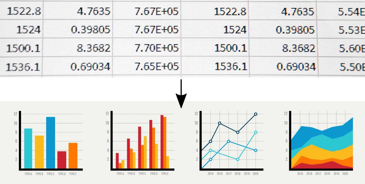
e.g.,bar chartsline chartsscatter plotshistograms

- Categorical, which includes non-numerical data such as names or categories
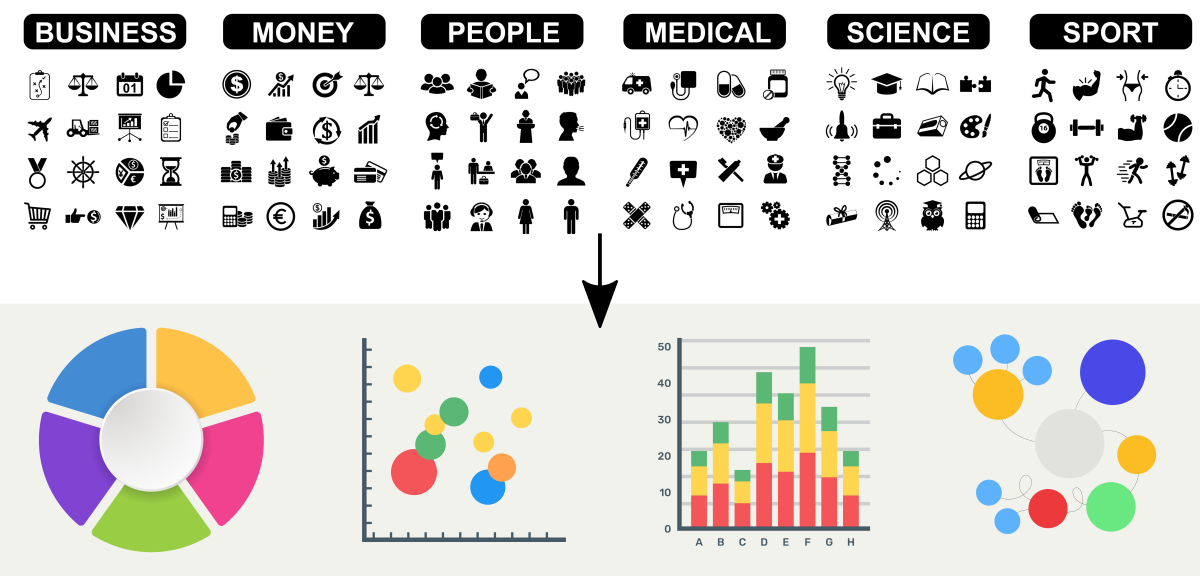
e.g.,pie chartsstacked bar chartsbubble charts

- Temporal, which includes data that changes over time
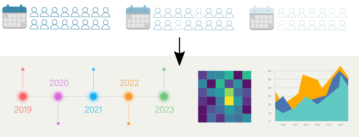
e.g.,line chartsarea chartsheatmaps

Tools
Data visualization tools can be categorized as either online or standalone. Online tools are typically accessed through a web browser and hosted on a remote server, while standalone tools are installed locally on a computer.
| tool | description | type |
|---|---|---|
| Tableau Public | Tableau Public is a free data visualization software that allows users to create and publicly share interactive and dynamic charts, graphs, maps, and dashboards. It is easy to use and offers a wide range of customization options. | online with GUI |
| Microsoft Excel | Microsoft Excel is a popular spreadsheet software that includes basic data visualization tools, such as charts and graphs. It is easy to use and widely available. | standalone with GUI |
| GNUPlot is a free and open-source command-line tool for creating 2D and 3D plots, graphs, and charts. It runs on various platforms, including Linux, macOS, and Windows. | command line (shell scripting) | |
| R | R is a programming language and software environment for statistical computing and graphics. It offers a wide range of data visualization tools, including charts, graphs, and maps. | command line (R programming) |
| Plotly | Plotly is a free online data visualization tool that allows users to create interactive charts, graphs, and other visualizations. It offers various Data App Workspaces including online Data Science IDE or local Jupyter notebooks (web-based). | web-based, command-line (python programming) |
| Highcharts | Highcharts is a JavaScript charting library that allows users to create interactive charts and graphs for web pages. | for web developers |
| Google Charts | Google Charts is a free data visualization tool that allows users to create a range of interactive charts and graphs, including scatter plots, pie charts, and line graphs. It is designed for developers but can be used by researchers with some programming experience. | for web developers |
How to get started?
To get started with creating high-quality and meaningful data visualizations using modern types of charts and interactivity options, the following steps can be helpful:
-
Define your research question and data
Begin by defining your research question and understanding the data that you want to visualize. This will help you identify the type of chart or graph that will be most appropriate for your data. -
Choose the right chart type
Based on your research question and data, select the most appropriate chart type to represent the data in the most effective and visually appealing way. Modern types of charts and built-in interactivity can offer additional layers of insights and visual interest. -
Select the right tool
Choose a data visualization tool that meets your needs and is appropriate for your skill level. Many tools offer interactive and animated features that can enhance your data visualization and create a more engaging experience for your audience. -
Design the chart
Pay attention to the design of your chart. Ensure that the chart is easy to read and understand by using appropriate labeling, colors, and fonts. Consider using interactivity options such as hover-over tooltips or interactive legends to provide additional information and insights. -
Share and refine
Share your data visualization with collaborators and peers. Then, refine your charts based on feedback and continue to iterate until you have created a high-quality and meaningful visualization that accurately represents your data and research question.
By following these steps and paying attention to best practices, you can create effective and engaging data visualizations that communicate the research findings to a wider audience.
By exploring the hands-on tutorials in this Workbook, you can gain a great starting point to learn how to create data visualizations. See the Further Reading section below to find a list of covered topics.
Further Reading
Gnuplot: creating plots in the UNIX ShellGnuplot: variables, loops, conditionals
Gnuplot: filled curves
Plotly-Dash: interactive plotting with Python
Introduction to Plotly (python)
Introduction to Dash (python)
Plotly graphing - interactive examples in the JupyterLab
Creating XY scatter plot
Creating 1D volcano plot
Creating heatmap
Creating dendrogram
Creating clustergram
RStudio – data processing & plotting with R
Creating boxplots in R
Creating heatmaps in R
Creating heatmaps in R using ComplexHeatmap
MODULE 09: Project Management
