
Introduction
Plotly Graphing Library for Python
In this article you will learn the basics about Plotly Graphing Library for Python.
Don’t hesitate to explore the user-friendly Plotly for Python documentation.
Plotly installation
Plotly is an external library and is not included in the Python standard library. Therefore, it requires a separate installation. Ensure you install a version that meets the specific needs of your application.
Getting started with the Plotly library as a Python developer is straightforward, regardless of the operating system you are working on. Just open a terminal window (or command prompt) and install Plotly with pip or conda following the commands below.
If you don’t have pip or Conda installed, start with the tutorial(s) that will guide you through this necessary step:
Install with pip
In terminal window, execute the command:
pip install plotly==5.8.1
The version specified in the command (e.g., 5.8.1) should be adjusted to suit the requirements of your application. It is best to use the latest stable release of Plotly, which can be checked and verified here.
Install with conda
In terminal window, execute the command:
conda install -c plotly plotly=5.8.1
For the efficient development of interactive Python applications, you will also need other libraries, such as Dash, Pandas or SciPy. So, it is a good idea to create a new virtual environment with Conda right away and add into it other modules over time.
conda info --envs                       # Active environment shown with *; on Mac Pro activate base for Miniforge3_x86
conda create -n graphing python=3.8     # replace 'graphig' with custom name
conda activate graphing
pip install plotly==5.8.1
Select development environment (IDE)
Coding in the Terminal
In the terminal window navigate to the desired location and create the empty script file, e.g. ex_plotly_graphing.py
touch ex_plotly_graphing.py
Open the file in the selected CLI text editor (Nano, Vim, mcedit, etc.) or VSC editor with GUI and go to Plotly import section in this tutorial.
Coding in the JupyterLab
In the terminal window execute the command provided below to start a new JupyterLab session (assuming you have Jupyter installed).
jupyter lab
If you don’t have a Jupyter installed, start with the tutorial that will guide you through this necessary step:
Once you have launched the Jupyter Development Environment in a browser window, navigate to the desired location in the file system and open a new file under the Python kernel.
Plotly import
Open your python script file or Jupyter notebook and copy paste the following code snippet:
# -*- coding: utf-8 -*-

import plotly
When you perform a simple import plotly, it primarily sets up the package namespace and provides access to the top-level attributes and submodules. However, it does not import any of the submodules’ contents directly. To use the functionalities provided by specific submodules like plotly.express or plotly.graph_objects, you still need to import those submodules explicitly.
Plotly submodules
The Plotly library has a modular architecture, which means that its functionality is divided into several submodules. This design allows you to import only the components you need, making your code more efficient and easier to manage. Below is a table listing the core submodules of Plotly, along with a concise description and the import statement for each.
| submodules | functionality | import statement |
|---|---|---|
| plotly.express | High-level interface for quick and easy plotting. | import plotly.express as px |
| plotly.graph_objects | Detailed and customizable graphing options. | import plotly.graph_objects as go |
| plotly.subplots | Tools for creating complex subplot layouts. | from plotly import subplots |
| plotly.figure_factory | Factory functions for specific types of figures (e.g., dendrograms, clustergrams). | import plotly.figure_factory as ff |
| plotly.io | Input/output operations, including saving figures and configuring renderers. | import plotly.io as pio |
| plotly.data | Sample datasets for testing and learning. | import plotly.data as data |
| plotly.colors | Utilities for working with colors and color scales. | import plotly.colors as pc |
By importing these submodules as needed, you can efficiently leverage Plotly’s powerful data visualization capabilities.
Plotly Express wrapper
Plotly Express is a built-in module in the Plotly library. It is a high-level interface for creating quick and easy plots. It provides a concise syntax for creating a wide range of interactive visualizations, making it particularly useful for exploratory data analysis.
Import Statement:
import plotly.express as px
Common plot types:
| function | description |
|---|---|
px.scatter() |
creates a scatter plot |
px.line() |
creates a line plot |
px.bar() |
creates a bar chart |
px.histogram() |
creates a histogram |
px.pie() |
creates a pie chart |
px.sunburst() |
creates a sunburst chart |
px.treemap() |
creates a treemap |
px.density_heatmap() |
creates a density heatmap |
px.density_contour() |
creates a density contour plot |
px.scatter_matrix() |
creates a scatter matrix plot |
px.imshow() |
creates an image plot (for heatmaps etc.) |
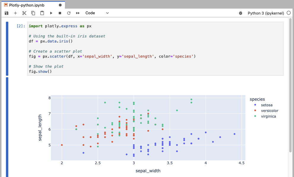
The iris dataset is a classic dataset in the field of machine learning and statistics. It consists of 150 observations of iris flowers, with each observation containing four features: sepal length, sepal width, petal length, and petal width. These features are used to classify the flowers into three species: Iris-setosa, Iris-versicolor and Iris-virginica. The dataset is often used for testing and demonstrating machine learning algorithms and data visualization techniques.
This example uses the built-in iris dataset to create a scatter plot of sepal width vs. sepal length, with different colors representing different species.
import plotly.express as px

# Using the built-in iris dataset
df = px.data.iris()

# Create a scatter plot
fig = px.scatter(df, x='sepal_width', y='sepal_length', color='species')

# Show the plot
fig.show()
Plotly Graph Objects
Plotly Graph Objects is a built-in module in the Plotly library. It manages the Figure object that represent the entire plotting area. Graph Object provides a detailed and customizable approach to creating plots. It is ideal for creating complex visualizations that require fine-grained control over every aspect of the plot.
Import Statement:
import plotly.graph_objects as go
Common plot types and Figure object:
| function | description |
|---|---|
go.Figure() |
creates a figure object |
go.Scatter() |
creates a scatter plot trace |
go.Bar() |
creates a bar chart trace |
go.Histogram() |
creates a histogram trace |
go.Pie() |
creates a pie chart trace |
go.Sunburst() |
creates a sunburst chart trace |
go.Treemap() |
creates a treemap trace |
go.Heatmap() |
creates a heatmap trace |
go.Contour() |
creates a contour plot trace |
go.Scatter3d() |
creates a 3D scatter plot trace |
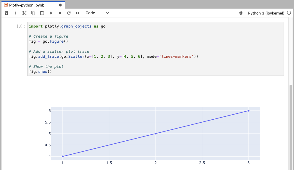
This example creates a figure and adds a scatter plot trace with both lines and markers.
import plotly.graph_objects as go

# Create a figure
fig = go.Figure()

# Add a scatter plot trace
fig.add_trace(go.Scatter(x=[1, 2, 3], y=[4, 5, 6], mode='lines+markers'))

# Show the plot
fig.show()
Plotly Subplots
Plotly Subplots is a built-in module in the Plotly library. It provides tools for creating complex subplot layouts, allowing you to create multi-plot figures with ease. This is useful for comparing multiple visualizations side-by-side.
Import Statement:
from plotly import subplots
Subplots function:
| function | description |
|---|---|
subplots.make_subplots() |
creates a figure with multiple subplots |
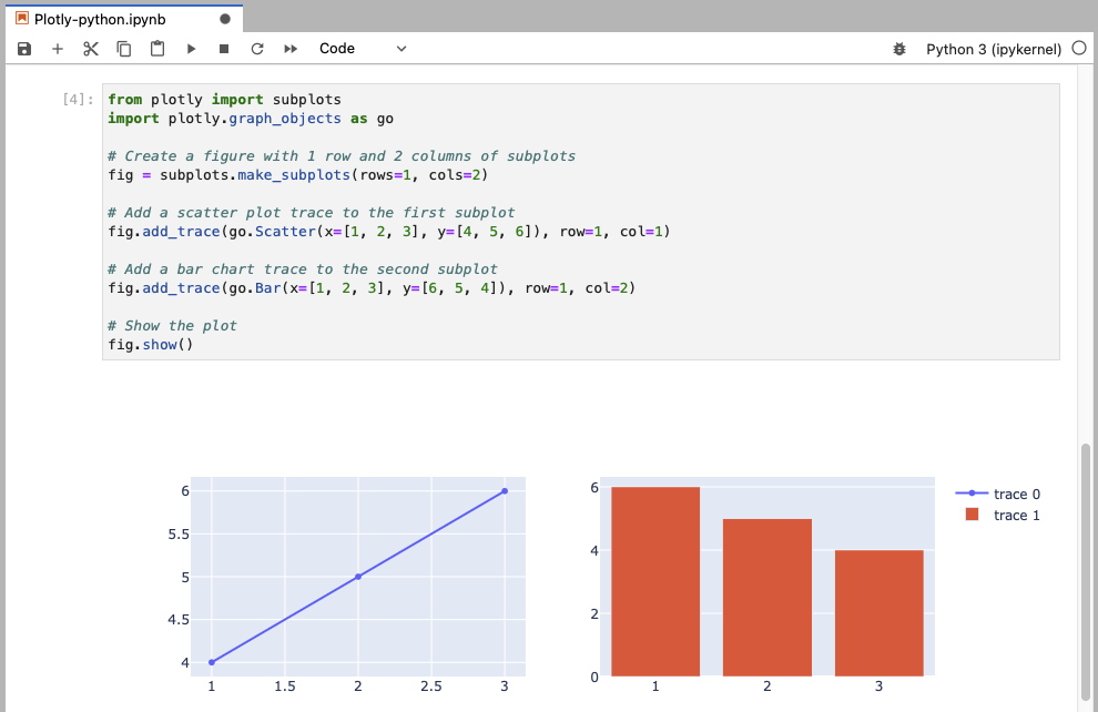
This example creates a figure with two subplots: a scatter plot on the left and a bar chart on the right.
from plotly import subplots
import plotly.graph_objects as go

# Create a figure with 1 row and 2 columns of subplots
fig = subplots.make_subplots(rows=1, cols=2)

# Add a scatter plot trace to the first subplot
fig.add_trace(go.Scatter(x=[1, 2, 3], y=[4, 5, 6]), row=1, col=1)

# Add a bar chart trace to the second subplot
fig.add_trace(go.Bar(x=[1, 2, 3], y=[6, 5, 4]), row=1, col=2)

# Show the plot
fig.show()
Plotly Figure Factory
Plotly Figure Factory is a built-in module in the Plotly library. It contains various factory functions for creating specific types of figures, such as dendrograms, clustergrams and annotated heatmaps. It simplifies the creation of these specialized plots.
Import Statement:
import plotly.figure_factory as ff
Figure Factory functions:
| function | description |
|---|---|
ff.create_dendrogram() |
creates a dendrogram |
ff.create_clustergram() |
creates a clustergram |
ff.create_annotated_heatmap() |
creates an annotated heatmap |
ff.create_distplot() |
creates a distribution plot |
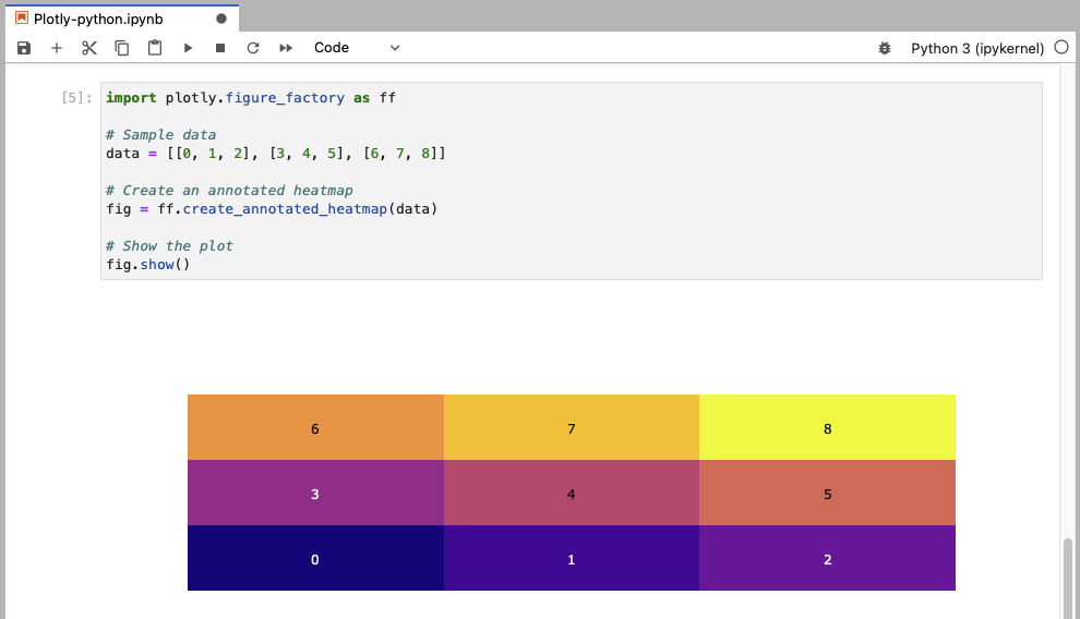
This example creates an annotated heatmap from a sample data array.
import plotly.figure_factory as ff

# Sample data
data = [[0, 1, 2], [3, 4, 5], [6, 7, 8]]

# Create an annotated heatmap
fig = ff.create_annotated_heatmap(data)

# Show the plot
fig.show()
Plotly IO
Plotly IO is a built-in module in the Plotly library. It provides functions for input/output operations, such as saving figures and configuring the default renderer. This is useful for exporting your visualizations and customizing how they are displayed.
Import Statement:
import plotly.io as pio
Input/Output functions:
| function | description |
|---|---|
pio.write_image() |
saves a figure as an image file |
pio.write_html() |
saves a figure as an HTML file |
pio.show() |
displays a figure using a specified renderer |
pio.renderers() |
manages and configures default renderers |
This example creates a scatter plot using Plotly Express and saves it as a PNG image using plotly.io.
import plotly.express as px
import plotly.io as pio

# Create a scatter plot using Plotly Express
fig = px.scatter(x=[1, 2, 3], y=[4, 5, 6])

# Save the plot as a PNG image
pio.write_image(fig, 'scatter_plot.png')
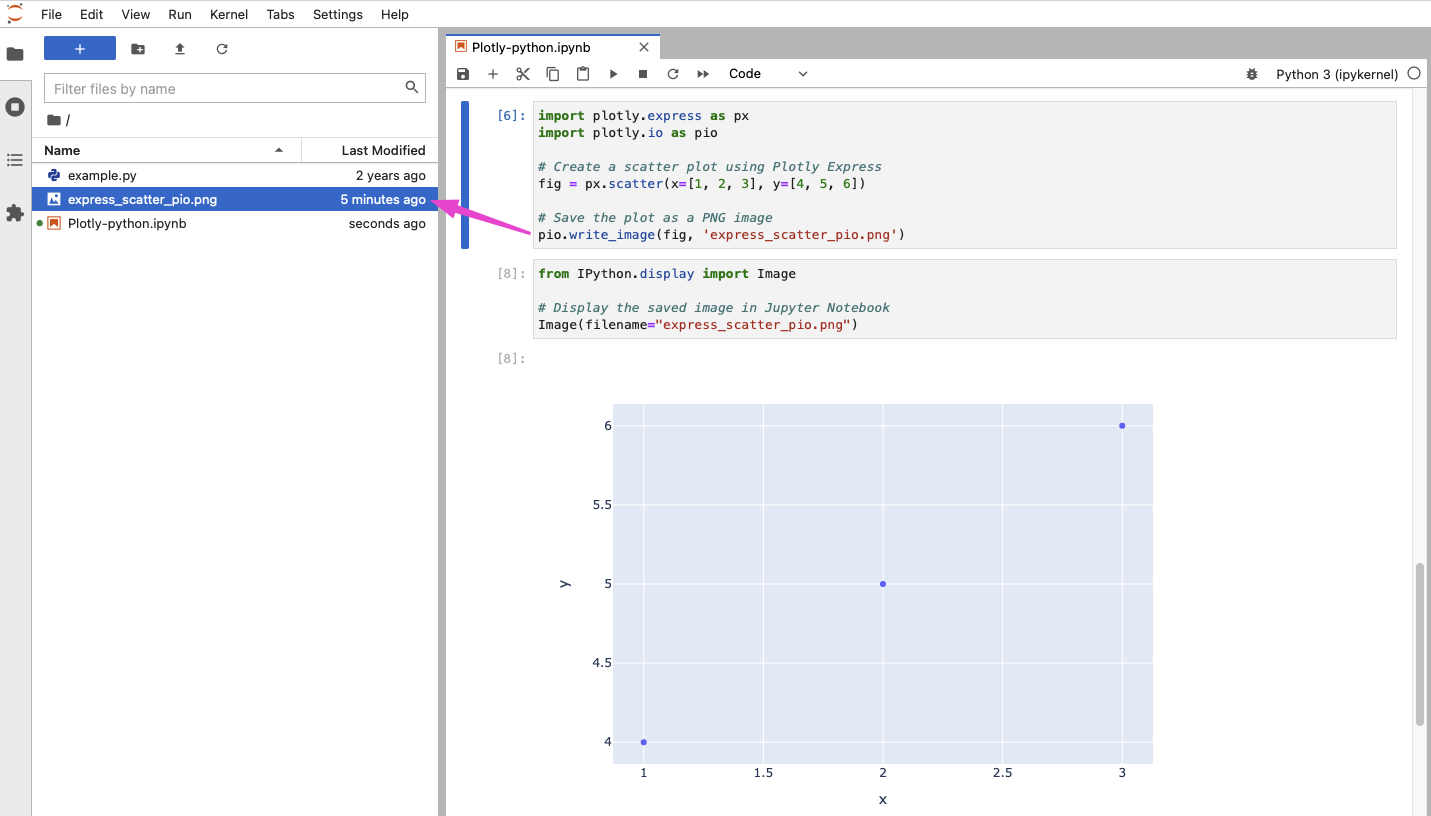
To display a saved plot in Jupyter Notebook after saving it with plotly.io.write_image or fig.write_image, you can use the IPython.display module to display the image file.
For a simpler way to save your figures as images, you can use the write_image method directly on the figure object. After creating your figure, simply call:
fig.write_image("filename.png")
Ensure you have kaleido installed:
pip install -U kaleido
or via conda:
conda install -c conda-forge python-kaleido
to enable rendering the figure to a static image file functionality. This method can be more convenient than using plotly.io.write_image(). Kaleido is now the recommended approach.
Plotly Data
Plotly Data is a built-in module in the Plotly library. It includes sample datasets that can be used for testing and learning. These datasets provide convenient data for trying out Plotly’s functionalities.
Import Statement:
import plotly.data as data
Load Dataset functions:
| function | description |
|---|---|
data.iris() |
Iris flower dataset |
data.tips() |
Tipping data |
data.gapminder() |
Gapminder global development data |
data.stocks() |
Stock prices data |
data.wind() |
Wind patterns data |
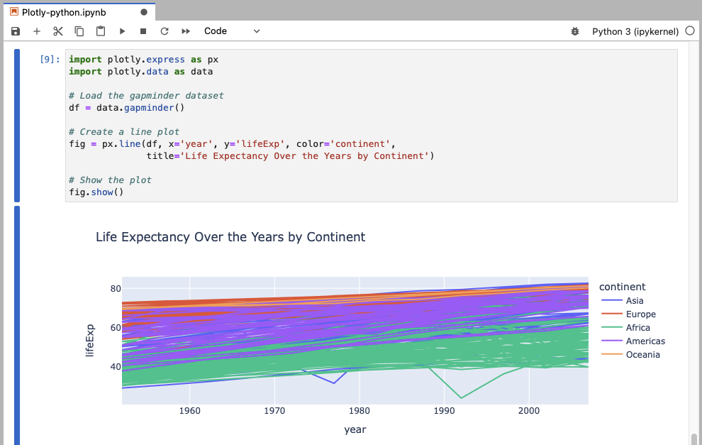
This example loads the gapminder dataset and creates a line plot showing life expectancy over the years, with different colors representing different continents.
import plotly.express as px
import plotly.data as data

# Load the gapminder dataset
df = data.gapminder()

# Create a line plot
fig = px.line(df, x='year', y='lifeExp', color='continent',
              title='Life Expectancy Over the Years by Continent')

# Show the plot
fig.show()
In the examples where data is loaded using plotly.data, you do not need to import pandas separately because Plotly’s built-in datasets are returned as pandas DataFrames. This allows you to use them directly with Plotly’s plotting functions without needing additional data management steps.
However, if you want to perform more complex data manipulations before plotting, you might still need to import pandas.
For the examples given above, you can add additional import for pandas like this: (assuming you have pandas installed)
import pandas as pd
Now you can use pandas functions to manipulate the DataFrame df if needed.
For example, you can filter the data to include only records after the year 2000 using pandas, and then creates a line plot showing life expectancy over the years for different continents.
import plotly.express as px
import plotly.data as data
import pandas as pd

# Load the gapminder dataset
df = data.gapminder()

# Manipulate the DataFrame: filter for data after the year 2000
df_filtered = df[df['year'] > 2000]

# Create a line plot with the filtered data
fig = px.line(df_filtered, x='year', y='lifeExp', color='continent',
              title='Life Expectancy Over the Years by Continent (Post-2000)')

# Show the plot
fig.show()
Plotly Colors
Plotly Colors is a built-in module in the Plotly library. It contains utilities for working with colors and color scales. It helps in customizing the appearance of your plots by providing predefined color scales and functions to manipulate colors.
Import Statement:
import plotly.colors as pc
Load Dataset functions:
| function | description |
|---|---|
pc.qualitative |
access to qualitative color scales |
pc.sequential |
access to sequential color scales |
pc.diverging |
access to diverging color scales |
pc.find_intermediate_color |
finds an intermediate color between two colors |
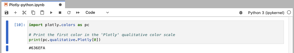
This example prints the first color from the ‘Plotly’ qualitative color scale.
import plotly.colors as pc

# Print the first color in the 'Plotly' qualitative color scale
print(pc.qualitative.Plotly[0])
Color Variables
Color variables in Plotly have a string type value provided in the one of the following forms:
- HEX color, e.g.,
"#FFFFFF" - HSL color, e.g.,
"hsl(hue, saturation,lightness)"
The Hue values are in degrees, from 0 to 360 (0 - red, 120 - green, 240 - blue). The saturation and lightness are in % from 0% to 100%. - RGB color, e.g.,
"rgb(red, green, blue)"
Each channel is provided as an intiger between 0 and 255, e.g., rgb(128, 0, 128). - RGBA color, e.g.,
"rgba(r, g, b, a)"
with ‘a’ value set up in range from 0.0 (transparent) to 1.0 (solid) - common name, e.g.,
"blue"
see Built-in Plotly colors section below
Built-in Plotly named CSS colors
(common names)
aliceblue,
antiquewhite,
aqua,
aquamarine,
azure,
beige,
bisque,
black,
blanchedalmond,
blue,
blueviolet,
brown,
burlywood,
cadetblue,
chartreuse,
chocolate,
coral,
cornflowerblue,
cornsilk,
crimson,
cyan,
darkblue,
darkcyan,
darkgoldenrod,
darkgray,
darkgrey,
darkgreen,
darkkhaki,
darkmagenta,
darkolivegreen,
darkorange,
darkorchid,
darkred,
darksalmon,
darkseagreen,
darkslateblue,
darkslategray,
darkslategrey,
darkturquoise,
darkviolet,
deeppink,
deepskyblue,
dimgray,
dimgrey,
dodgerblue,
firebrick,
floralwhite,
forestgreen,
fuchsia,
gainsboro,
ghostwhite,
gold,
goldenrod,
gray,
grey,
green,
greenyellow,
honeydew,
hotpink,
indianred,
indigo,
ivory,
khaki,
lavender,
lavenderblush,
lawngreen,
lemonchiffon,
lightblue,
lightcoral,
lightcyan,
lightgoldenrodyellow,
lightgray,
lightgrey,
lightgreen,
lightpink,
lightsalmon,
lightseagreen,
lightskyblue,
lightslategray,
lightslategrey,
lightsteelblue,
lightyellow,
lime,
limegreen,
linen,
magenta,
maroon,
mediumaquamarine,
ediumblue,
mediumorchid,
mediumpurple,
mediumseagreen,
mediumslateblue,
mediumspringgreen,
mediumturquoise,
mediumvioletred,
midnightblue,
mintcream,
mistyrose,
moccasin,
navajowhite,
navy,
oldlace,
olive,
olivedrab,
orange,
orangered,
orchid,
palegoldenrod,
palegreen,
paleturquoise,
palevioletred,
papayawhip,
peachpuff,
peru,
pink,
plum,
powderblue,
purple,
red,
rosybrown,
royalblue,
rebeccapurple,
saddlebrown,
salmon,
sandybrown,
seagreen,
seashell,
sienna,
silver,
skyblue,
slateblue,
slategray,
slategrey,
snow,
springgreen,
steelblue,
tan,
teal,
thistle,
tomato,
turquoise,
violet,
wheat,
white,
whitesmoke,
yellow,
yellowgreen
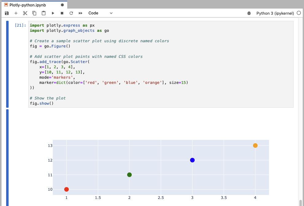
Here’s an example of a scatter plot using some of the named CSS colors:
import plotly.express as px
import plotly.graph_objects as go

# Create a sample scatter plot using discrete named colors
fig = go.Figure()

# Add scatter plot points with named CSS colors
fig.add_trace(go.Scatter(
    x=[1, 2, 3, 4],
    y=[10, 11, 12, 13],
    mode='markers',
    marker=dict(color=['red', 'green', 'blue', 'orange'], size=15)
))

# Show the plot
fig.show()
This example demonstrates how to use discrete named colors in a Plotly scatter plot.
- The
markerdictionary specifies thecolorandsizeof the markers.
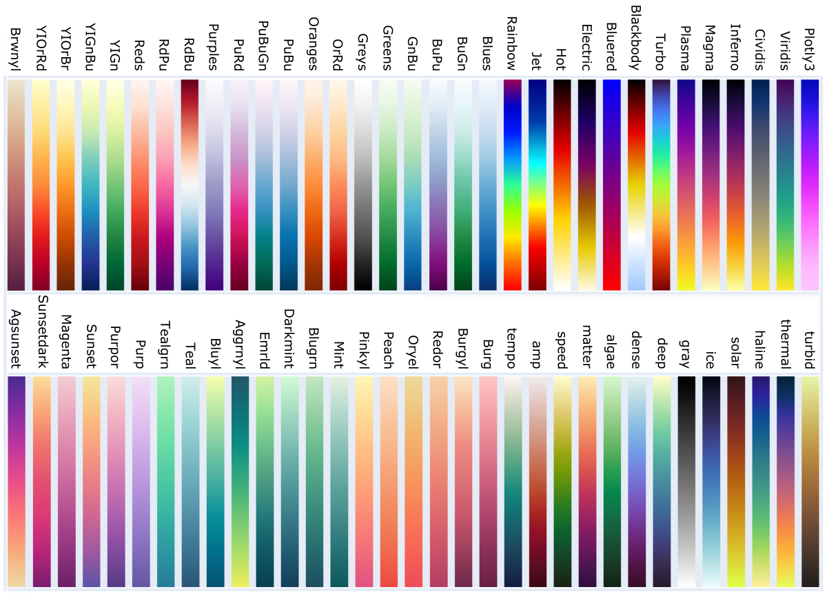
Built-in Plotly colorscales
To list built-in colorscales in Plotly, try this code snippet:
import plotly.colors as pc

# Accessing built-in Plotly color scales
color_scales = pc.named_colorscales()

# Print all available named Plotly color scales
print(", ".join(color_scales))
The expected output should be a list of colorscale names:
‘aggrnyl’, ‘agsunset’, ‘algae’, ‘amp’, ‘armyrose’, ‘balance’, ‘blackbody’, ‘bluered’, ‘blues’, ‘blugrn’, ‘bluyl’, ‘brbg’, ‘brwnyl’, ‘bugn’, ‘bupu’, ‘burg’, ‘burgyl’, ‘cividis’, ‘curl’, ‘darkmint’, ‘deep’, ‘delta’, ‘dense’, ‘earth’, ‘edge’, ‘electric’, ‘emrld’, ‘fall’, ‘geyser’, ‘gnbu’, ‘gray’, ‘greens’, ‘greys’, ‘haline’, ‘hot’, ‘hsv’, ‘ice’, ‘icefire’, ‘inferno’, ‘jet’, ‘magenta’, ‘magma’, ‘matter’, ‘mint’, ‘mrybm’, ‘mygbm’, ‘oranges’, ‘orrd’, ‘oryel’, ‘oxy’, ‘peach’, ‘phase’, ‘picnic’, ‘pinkyl’, ‘piyg’, ‘plasma’, ‘plotly3’, ‘portland’, ‘prgn’, ‘pubu’, ‘pubugn’, ‘puor’, ‘purd’, ‘purp’, ‘purples’, ‘purpor’, ‘rainbow’, ‘rdbu’, ‘rdgy’, ‘rdpu’, ‘rdylbu’, ‘rdylgn’, ‘redor’, ‘reds’, ‘solar’, ‘spectral’, ‘speed’, ‘sunset’, ‘sunsetdark’, ‘teal’, ‘tealgrn’, ‘tealrose’, ‘tempo’, ‘temps’, ‘thermal’, ‘tropic’, ‘turbid’, ‘turbo’, ‘twilight’, ‘viridis’, ‘ylgn’, ‘ylgnbu’, ‘ylorbr’, ‘ylorrd’
Appending ‘_r’ to a named colorscale reverses colors order, e.g., mint_r
Custom colorscale
You can also create your own colorscale as an array of lists, each composed of two elements. The first refers to the percentile rank, and the second to the applied color. Color can be provided in any string format among hex, hsl, rgb or common name.
e.g.,
custom_colorscale = [
                      [0.00, '#636EFA'],
                      [0.25, '#AB63FA'],
                      [0.50, '#FFFFFF'],
                      [0.75, '#E763FA'],
                      [1.00, '#EF553B']
                     ]
Here’s an example of using a custom colorscale in a simple Plotly heatmap, where:
go.Heatmap()creates the heatmap using the datazand the custom colorscalecolorscale=custom_colorscale.
import plotly.graph_objects as go

# Define the custom color scale
custom_colorscale = [[0.00, '#636EFA'], [0.25, '#AB63FA'], [0.50, '#FFFFFF'], [0.75, '#E763FA'], [1.00, '#EF553B']]

# Sample data for the heatmap
z = [ [1, 20, 30], [20, 1, 60], [30, 60, 1] ]

# Create the heatmap with the custom color scale
fig = go.Figure(data=go.Heatmap(z=z, colorscale=custom_colorscale))

# Show the plot
fig.show()
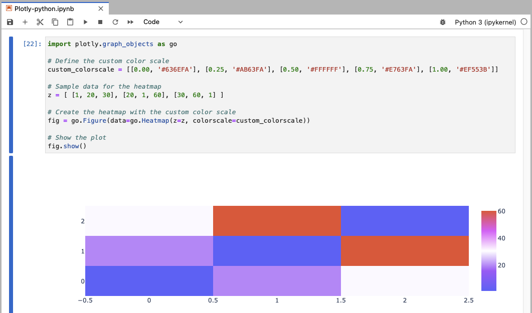
The custom colorscale is displayed as a gradient bar in the legend on the right side of the plot. This gradient bar visually represents the mapping of data values to the specified colors in the custom color scale.
Further Reading
Introduction to Dash (python)Plotly graphing - interactive examples in the JupyterLab
Creating XY scatter plot
Creating 1D volcano plot
Creating heatmap
Creating dendrogram
Creating clustergram
RStudio – data processing & plotting with R
Creating boxplots in R
Creating heatmaps in R
Creating heatmaps in R using ComplexHeatmap
MODULE 09: Project Management