Introduction
Scientific graphic design is the art of visually communicating complex scientific concepts, ideas, and information through various forms of visual representation. It involves the use of design principles, typography, color theory, and graphic elements to create effective visual infographics.

The main goal of scientific graphic design is to make scientific information easily understandable and visually appealing to a wide range of audiences. This involves selecting the right design elements, such as fonts, colors, and images, to enhance the message and convey the information accurately.
Scientific graphic design is an essential tool that can help you create visual aids for scientific presentations, academic publications, research posters, and educational materials. By using design principles and graphic elements, you can increase engagement and understanding among audiences, and make scientific information more accessible.
Scientific Graphics
There are two main categories of scientific graphics:
- creating data visualizations: charts, graphs
- designing infographics: diagrams, schemas

Both data visualizations and infographics are used to present information visually. Infographics are primarily designed to communicate complex ideas and concepts, while data visualizations are focused on representing data.
Understanding the differences between these two types of scientific graphics can help researchers choose the right type of visualization for their specific needs.
In this section we provide introduction to the types and roles of Infographics. See section to learn more about data visualization.
Designing Infographics
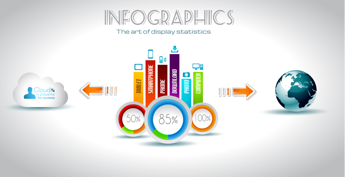
Infographics, are visual representations of information, data, or knowledge that are designed to be easily understood and engaging. They are typically used to communicate complex ideas, processes, or concepts.
The main goal of designing infographics is to make information more accessible and engaging for the audience. Infographics can include various design elements, such as illustrations, icons, text, and images, to tell a story and convey information in a way that is both interesting and easy to understand.
Infographics can be a helpful tool in your research.
One unique advantage of using infographics is their ability to condense complex information into an easy-to-understand visual format. Another unique advantage of infographics is their ability to tell a story. Infographics can also be a helpful tool for researchers who want to engage with the audience beyond the traditional academic community.
Types of infographics
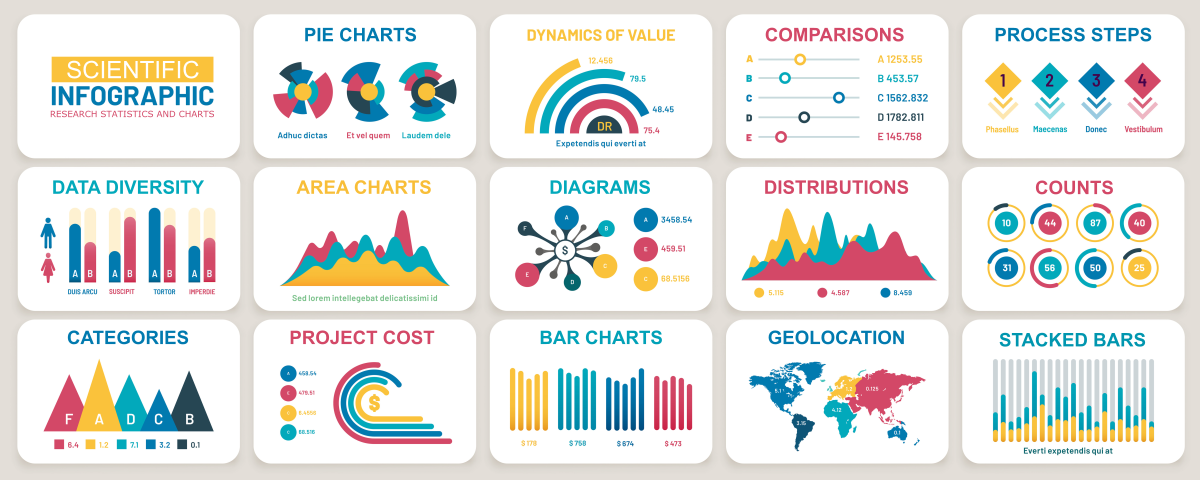
Start by choosing the appropriate type of infographic for your data and research question.
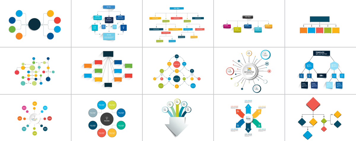
1. Flowcharts
Flowcharts are a type of infographic that can be used to illustrate a series of steps or a process. They are particularly helpful in research when visualizing the steps involved in a study design, data collection, or analysis.

2. Comparison Infographics
Comparison infographics can be used to compare different hypotheses or pipelines. They can be helpful in research when comparing different study approaches, outcomes, or treatment options.

3. Timeline Infographics
Timeline infographics can be used to illustrate the sequence of events or a historical context of a study. They can be helpful in research when visualizing the progression of a study over time or the historical context of a research topic.

4. Statistical Infographics
Statistical infographics can be used to display statistical outcome in a visually appealing and easy-to-understand way. They can be helpful in research when visualizing study results, trends, or relationships between variables.

5. Geographic Infographics
Geographic infographics can be used to display information that is location-specific. They can be helpful in research when visualizing study results by location, or when comparing different geographic regions.

Tools
Scientific infographics tools offer a range of features and customization options that allow researchers and scientists to create compelling and informative visual content. The choice of tool will depend on the user’s specific needs, level of expertise, and available resources.
Online tools for creating scientific infographics are often cloud-based and can be accessed from any device with an internet connection. These tools typically require users to sign up for an account and may offer a range of free and paid features.
Some popular online scientific infographics tools include:
| tool | description |
|---|---|
| Canva ⤴ | Canva is an online design tool that allows users to create a range of visual content, including scientific infographics, posters, presentations, and other graphics. It offers a range of free and paid templates, graphics, and design elements. |
| Piktochart ⤴ | Piktochart is an online tool that allows users to create professional-looking infographics, presentations, and reports. It offers a range of free and paid templates, graphics, and design elements. |
| Infogram ⤴ | Infogram is an online tool that allows users to create interactive charts, maps, and infographics. It offers a range of free and paid templates, graphics, and design elements. |
Standalone tools are software programs that are installed on a user’s computer and run locally. These tools typically offer more advanced features and customization options compared to online tools.
Some popular standalone scientific infographics tools include:
| tool | description | |
|---|---|---|
| GIMP ⤴ | GIMP (GNU Image Manipulation Program) is a free and open-source raster graphics editor that can be used to create scientific infographics. It offers a range of advanced features and customization options. | |
| Inkscape ⤴ | Inkscape is a free and open-source vector graphics editor that can be used to create scientific infographics, diagrams, and illustrations. It offers a range of advanced features and customization options. | |
| Adobe Illustrator ⤴ | Adobe Illustrator is a professional vector graphics editor that allows users to create high-quality scientific infographics. It offers a wide range of customization options, but is more expensive and complex than other tools. | |
| CorelDRAW ⤴ | CorelDRAW is a professional vector graphics editor that can be used to create high-quality scientific infographics, diagrams, and illustrations. It offers a wide range of customization options, but is more expensive and complex than other tools. |
Why you should do it yourself?
Learning to create scientific graphics can be very beneficial for researchers, as it allows them to have control over the design and content of the visuals, saves time and resources, and helps to improve their communication abilities. With the wide range of tools and resources available, researchers can easily learn to create effective scientific graphics that enhance the quality of their work and presentation of results.
How to get started?
Researchers can create good quality scientific graphics by themselves once they learn a few tools. By learning how to use these tools, researchers can create a variety of scientific graphics, diagrams, and infographics, which can enhance the quality of their work and improve their ability to communicate their findings effectively.
By exploring the hands-on tutorials in this Workbook, you can gain a great starting point to learn how to design infographics. See the Further Reading section below to find a list of covered topics.
